August 2024: This post was updated to reflect changes to how website design settings are accessed.
Exciting news this week!
Homepages just got more customizable on Substack. Plus the labels used in the website design settings is now less confusing.
The best thing about this change is that it is now possible to pin more than one post on your homepage - hooray!
The worst thing is I’ve just had to re-write multiple chapters in my Substack book (sob).
What’s new
Less confusing language and better descriptions for options
Until today, the options for homepage layouts had confusing labels, and it was difficult to figure out what each option would look like, except by using trial and error.
On the other hand, when I started my main publication in 2021, it wasn’t possible to preview layouts, so you had to activate new website settings and then go to your site on a new window to see what they looked like in the live environment, which was annoying. We’ve come a long way.
Homepage customizations are now in two sections
It’s always been the case that the top part of a homepage could be customized separately from the bottom part. However, this is now much easier to understand when in the site design settings.
The top part of the homepage is now called ‘Intro’, instead of ‘Hero’ and the bottom part of the page is called ‘Body’. The customizations for the top and bottom (Intro and Body) haven’t changed much, except that more pinned posts can be used in ‘Newspaper’ and ‘Magazine’ layouts.
Custom content blocks
The ability to create custom content blocks is the biggest change to homepage customization. To create custom blocks you must first activate the ‘Advanced layout’ toggle on the homepage customization page.
Publication dashboard > Settings > Branding > Publication theme > Edit theme [button] > Homepage > Advanced layouts [toggle on] > + Add block [button]
Warning: if you’re a WordPress nerd and just started imagining unlimited block options you’ll be disappointed. Custom content blocks cannot be used to display free text, images or html. They only support Substack-generated content such as post previews, CTAs, recommendation lists and the like.
Content blocks can display post previews or subscribe calls to action, optionally accompanied by ‘modules’, which are explained below.
There are four choices for content blocks:
A list of posts, with ‘custom sidebar options’ – see below
A grid of posts with ‘custom sidebar options’
Feature – which is a highlighted group of posts belonging to a section or tag
A subscribe call to action
Custom sidebars are columns you can add to list of post previews or grids of post previews in your custom content blocks. If you choose to have a ‘sidebar’ your content block will contain a list or grid of posts and a column on the left or the right of the post previews.
The column contains one or more modules. Modules are: subscribe call to action, recommendations (recommendations you make), links, contributors, newsletters, podcasts or top posts.
You can have up to ten content blocks on your homepage, each with a different type of post and with different ‘modules’ appearing in their sidebars.
For example, if your publication has multiple contributors, you could make a content block with a group of posts written by a certain person, and add their name and profile picture to the content block using the ‘Contributors’ module.
Other changes: ‘Branding’ section, Wordmarks, Welcome Page Preview, Post Preview
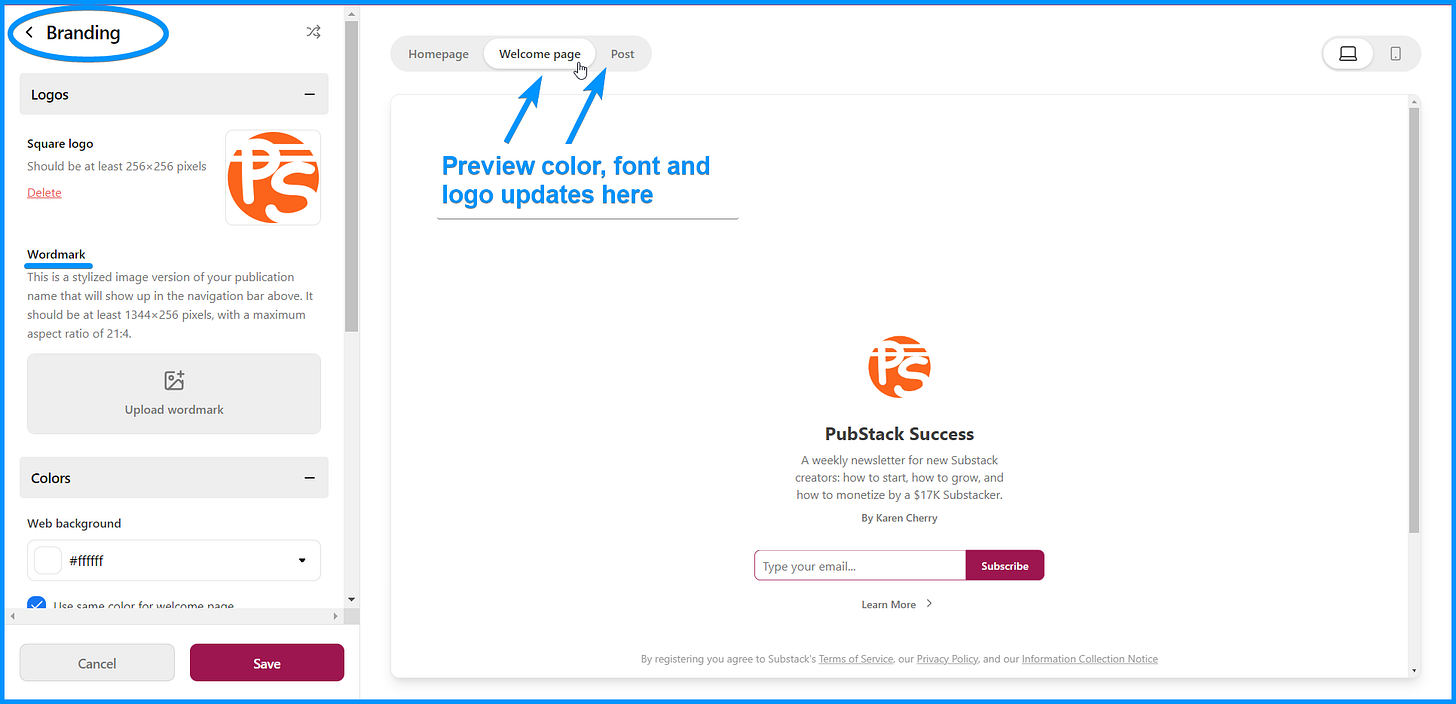
Colors, fonts, wordmarks and logos are now accessed and managed from ‘Publication theme.’
Access the colors, fonts, wordmarks and logos from the Branding section of your publication dashboard.
Publication dashboard > Settings > Branding > Publication theme > Edit theme [button] > Branding
You can also see a preview of your welcome page and posts from the site design pages. This allows you to review how changes to fonts, colors and logos will appear on those pages.

Final thoughts
These changes are a major improvement to both the customization options available and the way they are organized and described for publication owners. I’m thrilled with them.
What do you think? Have any of you added a custom content block to your homepage yet? If you have, share a screenshot in the comments.
Have a wonderful week,
Karen
P.S. Availability for my one-on-one Substack help sessions is becoming limited as I prepare for a series of travel adventures in the coming months. If you want to book a session, don’t delay.
Cover image: vectorpocket on Freepik


Thanks for this - I’m planning to have a look at the options in the next couple of days.
Is it worth having a separate website, say using Wordpress, alongside Substack? I would use it for writing that doesn’t fit my Substack topic, as well as to send traffic to my Substack posts - as well as a backup. What are your thoughts?
Thanks 😊
I have seen it, but the UX doesn’t still seems exciting may be because I’m not a tech person.
I feel like one needs a clear skill in graphic design to put it together properly as a magazine or blog. I wonder if there is anyone in substack who teaches how to design substack to be abit more colorful or who has a very well designed substack.
All the design I’m seeing either confuses user from web or is normal