What is a Substack Wordmark?
And do you need one for your newsletter?
This post was brought to you by the Substack Starter Kit, your all-in-one toolkit to launch and grow a successful newsletter with confidence and speed. Everything you need to start, plan, and grow a Substack publication, ready to use and easy to follow.
Hey there,
This week I celebrated the 100th issue of my other newsletter (woo hoo!) and it passed $13K in gross annual revenue. I also qualified as a bush firefighter (so proud), the training took me way out of my comfort zone. It’s been a big week!
Today’s email is about wordmarks.
A wordmark is a heading or title that is presented as an image, rather than text. Wordmarks are also known as logotypes - think of a wordmark as a font-based logo.
On Substack, a publication’s wordmark appears at the top of the publication’s homepage and at the top of each online post and page.

In this email I’ll explain:
Do you need a wordmark for your publication?
How to get a wordmark
What size is a Substack Wordmark?
How to add a wordmark to Substack
Best practices for Substack wordmarks
Pitfalls to avoid
Let’s get to it.
Do you have to have a wordmark on Substack?
Many publications use wordmarks because they add personality to a publication’s pages and posts.
Wordmarks are optional. Many popular Substack publications do not have wordmarks.
Without a wordmark, the publication’s name is displayed in a simple font at the top of each post and page, as in the picture below.

How to get a wordmark for Substack
You can get a designer to create a wordmark for your Substack publication, or you can make your own.
Because a wordmark is an image file —accepted formats are png or jpeg — you need to use image-making software to create your own wordmark. The most popular software is Canva, but Photoshop, Paint.net and Microsoft Paint are all fine too.
Canva is online software that is intuitive to use. There are free and paid plans, but you can do almost everything you need for a Substack publication using the free plan.
To create a wordmark you need an image size of 1344 x 256 pixels. In Canva, click ‘Custom size’ on the home page to make a canvas of the correct size — there are no pre-built templates for this particular size or shape in Canva.
Add text elements to your wordmark design, making sure that the text fills most of the space.
What size is a Substack wordmark?
For Substack, the wordmark should:
be at least 1344 × 256 pixels, and
have a maximum aspect ratio of 21:4.
How to add a wordmark to Substack
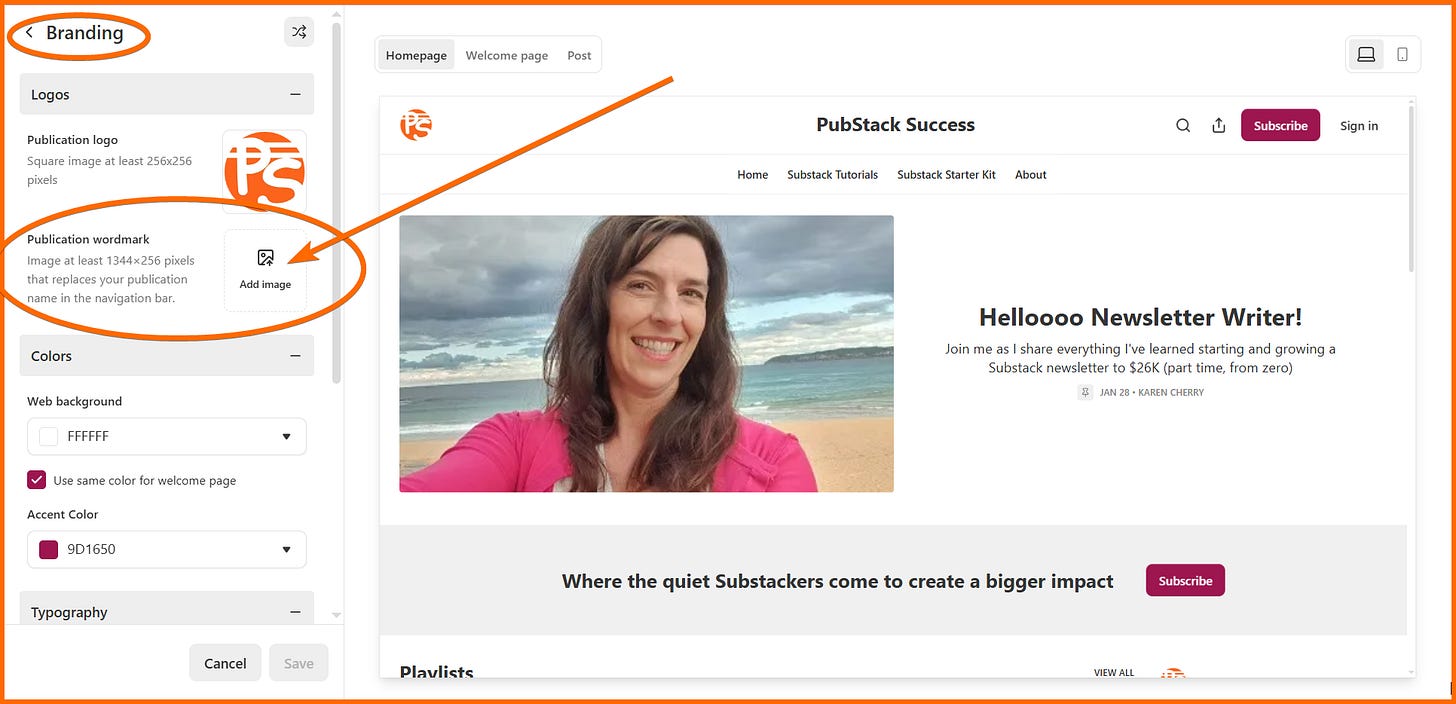
To add a wordmark to your publication, navigate to the ‘Creator Tools’ (Branding) section of your publication settings to open a page called ‘Theme Settings’. On that page, click ‘Branding’, then find ‘Publication Wordmark’ and click ‘Add image’.
Publication dashboard > Creator Tools (Branding) > Branding > [Publication wordmark] Add image
or
Publication dashboard > Settings > Website > ‘Go to website theme editor’ [button]> Branding > [Publication wordmark] Add image
If the upload is successful, you will see the wordmark displayed.
Best practices for Substack watermarks
When designing a watermark, the focus should be on the words. Make them large and easy to read.
Check out other publications to see which styles work best.
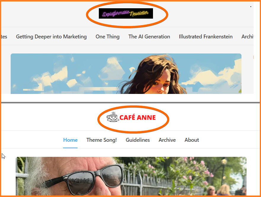
If you can, use a transparent background for your design, rather than a white or black background. For example, the Deplatformable wordmark pictured near the top of this post looks great when viewed in screen-dark mode on a black background, but not so great on a screen with a white background.
Transparent backgrounds are only possible with png file formats, not jpeg formats.
To get a transparent background you can upgrade to a premium Canva account which will allow you to export your design with a transparent background, or use a free image editing tool like Paint.net to select and delete negative spaces.
Test your design after you’ve uploaded it by visiting your publication’s pages and posts in dark and light modes to make sure the words are readable.
Pitfalls to avoid
Wordmarks with colored backgrounds don’t look as good as those with white, black or transparent backgrounds.
Leaving empty space around the edges of your design is unnecessary and will result in words that are too small on web pages and the Substack app. Substack displays your wordmark with a lot of empty space around it, so you don’t need any space inside your design; bring the words right to the edge of the image.
Don’t overthink it. You don’t need a watermark to have a successful Substack publication and it can take hours of your precious time to make one. Your time is probably better spent on creating top-quality content or improving your About page.
Closing thoughts
You don’t need a watermark for your Substack publication, and there are plenty of successful pubs without one. It’s better to spend your time making high-quality content than fiddling about with wordmark designs.
If you do decide to use one, keep the letters large and make sure they extend right to the edges of the image.
Transparent backgrounds work best.
Upload your wordmark in the basic settings part of your publication dashboard.
😀🍒😀
That’s it for this week.
Let me know if you need a hand with your wordmark, or anything else. And have a great weekend.


Thank you! This is EXACTLY what I was looking for! 🥰
Congrats on the triple triumph, Karen! Especially the bush firefighter. I’m imagining that was an epic journey and achievement to go on.
I’m just starting out with Substack and discovered wordmarks in my settings and had jotted it down to look into later. So thank you for the info - and the encouragement not to overthink them, which old me would definitely have done ;)