Hello Substack creator!
Have you had an awesome week? I hope so.
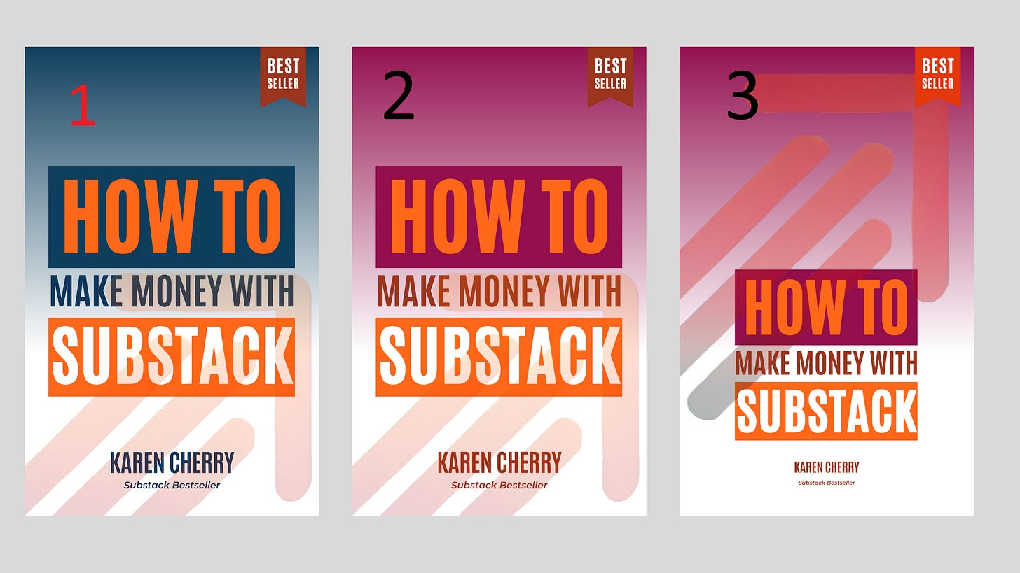
Today I want to ask a favor of you. Can you help me choose a book cover for my upcoming book?
Below are a bunch of choices, numbered from 1 to 9. Simply vote for the number you like best in the poll*, or if you have suggestions - such as combining elements from two or more covers write them in the comments.
Finally, in keeping with my promise to always give you guys something helpful in every post, at the end you will find three of my most-read Medium posts about Substack, with friend links so you can read them without a Medium membership.
*Polls can only have 5 answers max so I need three polls - annoying! I fear I have given you too many choices anyway. Making a book for people to buy (or reject) is scary.
Last week I talked about keeping promises to your readers. So it would be remiss of me not to include something you might find helpful on your Substack journey. Here are three of my most-read Medium posts, with friend links so you can read them without a Medium membership. Enjoy!
Thanks for helping me choose a cover for my book. It will be available for pre-order soon. Have a great weekend,
Karen


Nine is the best because it's most clear, though I might tweak it a little. Make bestseller bookmark orange. I think they all need more tweaking. Simple is best, but not TOO simple. Don't love the lightbulbs or the dollar sign. I didn't know what they were at first. I do like that "make money with" on one line. I'm a graphic designer, so if you need help with this, you can find me at https://styleyourstack.substack.com Cheers!
I don’t like any of them, they don’t look finished. I think if you use blue (which is more authoritative) then go with a more bold blue- navy or cobalt. The text is difficult to read on all of them because it doesn’t stand out enough. In design you need contrasting colors so people can see the text. I would advise you to work with a professional cover artist.